From PSD to Working UI in a Day
For years, the most beautiful interface designs I saw were just that: designs. Shots on Dribbble, PSDs on DeviantArt, concepts full of depth, light and texture. Seeing one of them actually working on a web page, with real interactions and animations, was a huge amount of work. Most of the time nobody even tried. The concepts were very pretty, and then they faded away, because getting from looking at them to using them was too hard.
That gap is getting much thinner.
Aparato
Aparato is a skeuomorphic design system in plain CSS: a precision appliance in the Braun tradition, with a light panel, dished keys, knobs, graphite levers and a single orange signal. Every control on the example page works. Buttons toggle, knobs turn, levers move.
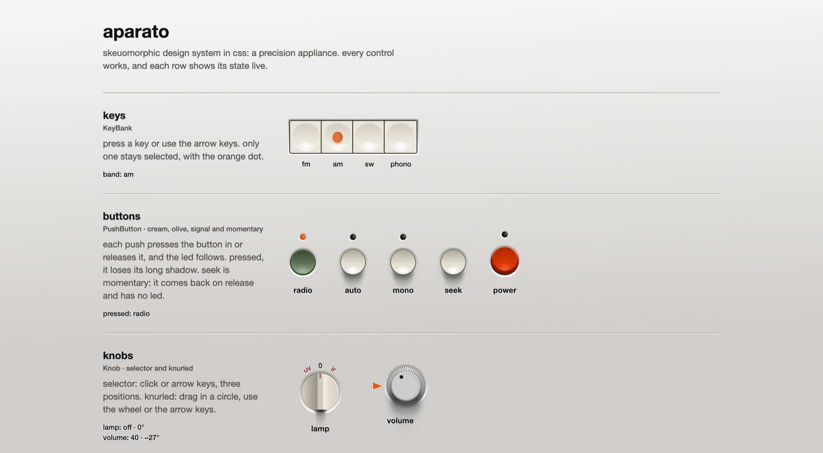
Try the live demo on GitHub Pages: press the keys, push the buttons and turn the knobs.
I built it with Claude Opus 5.5, starting from a .psd. Going from the PSD to something usable on the web took about a day.
The result is small: a tokens.json with every value, one CSS bundle of about 250 lines and about 50 lines of JavaScript for the knobs and buttons. No build step, no framework. The code is on GitHub.
How the PSD became CSS
The interesting part is that nothing was eyeballed. The values come straight from the layer effects in the PSD, at 1x size, and each Photoshop effect has a CSS translation:
- Shadows: a Photoshop shadow has an angle and a distance. With angle
aand distanced, the CSS offset isx = −cos(a)·d,y = sin(a)·d. The global light comes from the top right at 30°, so every highlight and shadow in the system agrees on where the light is. - Gradients: the CSS angle is
90 − PS angle, reversed gradients reverse their stops, and a scaled gradient moves each stop to50 + (p − 50)·s. - Strokes: an outside stroke is a border or a
box-shadowwith spread, an inside stroke isinset, and a gradient stroke is a transparent border with apadding-box/border-boxbackground. - Sizes: they come from the shape's vector mask, not from the layer rectangle, which has an extra pixel of transparency per side.
Doing this by hand, layer by layer, is the kind of work that kills a side project. With AI it became a conversation: read the layer, convert it, check it in the browser, adjust.
Credit where it is due
None of this exists without the people who designed it. The original design is "Braun UI" by Adrien Olczak, on Dribbble. The values were measured from "Free Website UI .PSD", posted by YesIMaDesigner on DeviantArt. The PSD is not in the repository, and the MIT license covers only my code, not their design.
If AI makes it easy to turn a design into code, it also makes it easy to forget whose design it was. Giving credit to the original designers has to be part of the process, not a footnote.
A skill for this
After doing this once, I think the process can be standardized: a skill, or a small kit of skills, that takes a PSD and produces tokens, components and an example page, always following the same conversion rules. And always recording who the original designer is and what the license allows, as one of the steps.
Interfaces with depth again
What excites me the most is what this means for UI. The me of a few years ago would never have believed this was possible so easily.
For a long time, flat and minimal won partly because it was easy to build. A flat rectangle with a label is cheap. A knob with a knurled edge, a light source and an embossed scale is not. Now that the cost of building a design like this is dropping, I expect a change of direction. I'm tired of seeing the same flat, plain square button everywhere.
There is something more satisfying about interacting with something that seems to have depth, light and texture. I think interesting things are coming for the world of UI.